Have you noticed some changes around China’s major cities recently?
Many people have been posting pictures of streets from Shanghai and other cities of the shop signs having a unified look; same background and similar type. A very different style from the unique and creative signs we are used to seeing!
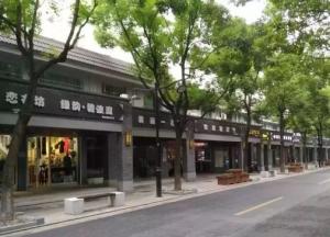
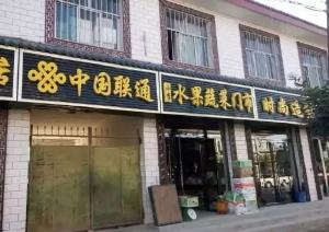
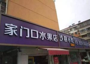
From a distance, it looks neat but also quite dreary. Definitely not appealing to the eye.
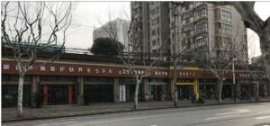
When the signs are all unified, shoppers are left confused because they all look the same, they’re not sure where to go.
Even shop owners were upset with the change from their original features.

So why did the cities change these signs?
The government’s intentions were good. They’ve gone to great lengths to repair old and damaged signs as there had been many incidents of signs falling in public areas and hurting pedestrians. The government is trying to enhance the image of cities and create a beautiful appearance.
In the case of Shanghai’s Changde road, the Federation of Trade Unions in Shanghai’s Jing’an District responded that the street facades were being renovated. However, they argued that they didn’t make a good color selection of the signboard design and it has been timely rectification.

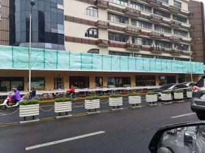
(now)
As long as anything is standardized and homogenized, it will lose its uniqueness and character.
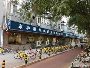
Actually, it goes back to ancient China. A long scroll of Song Dynasty genre painting, “Riverside Scene at Qingming Festival,” offers a glimpse of the times.
In the Ming and Qing dynasties and the Republic of China, the unique signs of culture have become mature and perfect.
What do you think?
Do you like the unification of the signs or are you more attractive to the unique shops?
Comment below!